


Key points to remember
- For a chic everyday silhouette, play with shades (pearl, medium, anthracite) and vary tones rather than uniforming everything.
- To modernize pants in a light shade, bet on pastel tones or a neutral palette (ecru, beige, soft blue), simple and elegant.
- For more originality, introduce patterns (checks, fine stripes, houndstooth): they add texture without weighing down the silhouette.
- Depending on the season, the approach changes: in winter, favor dense tones; in mid-seasons, dare brighter shades (mustard, khaki, burgundy) to enhance the elegance of the pieces.
Gray is an essential wardrobe base: it structures a silhouette, brings natural elegance, and allows for infinite combinations. That’s precisely what makes it such an easy color to adopt… and sometimes tricky to liven up. We then wonder which color goes best with gray, depending on the shade (light or dark), the piece (pants, coat, dress), and the desired effect, to also create an elegant and balanced spring look.
The goal is not just to “put a color with gray,” but to create a balance: brighter, softer, more contrasted, or more sophisticated.
Why choose gray?
This color has the advantage of being both neutral and expressive. Depending on its shade, it can evoke softness (pearl, light), modernity (steel), or depth (anthracite). It highlights cuts, reveals materials (tweed, wool, knit, satin) and naturally fits into seasonal palettes.
The advantages of gray in your wardrobe
- Versatility: it adapts to everyday outfits as well as more dressed-up looks.
- Immediate elegance: especially in pants or coats, it structures without hardening like black.
- Ease of pairing: it accepts both neutral tones and bold shades.
Its combinations: an infinite palette
Pairing it with white: a minimalist and bright duo
For those who like clean silhouettes, white is the safest combination. It brightens it and accentuates its neat and modern aspect, especially with a light tone.
Black: timeless elegance
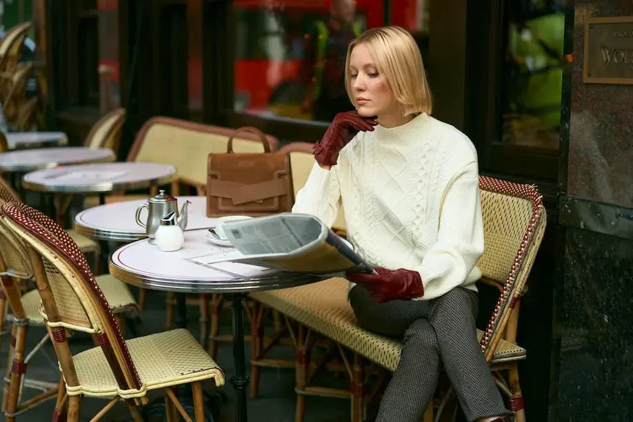
Black densifies it and gives a very urban, very controlled look. To avoid a too “closed” result, the balance is played on textures and shades: heather gray with deep black, or anthracite with black.
Pink: a subtle femininity
Pink immediately adds delicacy to gray: dusty brightens light grays, while more intense pinks (raspberry, fuchsia) pair better with medium or dark tones.
Beige: chic, soft, naturally refined
Beige, ecru, sand, or camel: these tones soften gray and give a very contemporary elegance. It’s an ideal combination if you like neutral, sophisticated, easy-to-wear palettes.
Red: a bold contrast
Red is perfect if you’re looking for a stronger combination: it gives character to gray, and gray makes red easier to wear.
Navy blue: sophistication and balance
Navy blue is a softer alternative to black. With gray, it creates an elegant, structured, always balanced silhouette.
Yellow: the energy of a bright contrast
Yellow, especially in mustard version, warms up gray. It brings energy without requiring a complex outfit: a single piece or an accessory is enough.
Bright shades: controlled modernity
Gray is one of the best “supports” for strong colors (emerald green, electric blue, fuchsia). To maintain an elegant harmony, prioritize a single bright color in the outfit.
How to match it according to your skin tone and style?
Getting the combinations right also means considering what happens near the face: the shade of the color, the color of the top, the overall harmony. Two people can wear gray and pink and get very different results depending on the tone of pink, the depth of gray, and the level of contrast that highlights the complexion.
Choose gray according to your complexion
Without turning your wardrobe into a technical exercise, a few guidelines are enough:
- Cool undertone complexions (often more harmonious with silver, blues, certain pinks): favor cool grays (pearl, bluish, or steel). They naturally match white, dusty pink, navy blue, and light blue.
- Warm undertone complexions (often enhanced by gold, camel, warm browns): turn to warm grays (greige, grayish taupe, "stone"). They pair perfectly with beige, cream white, mustard yellow, terracotta red, and khaki green.
Tips for matching it to your hair
Hair color significantly changes the overall effect, especially with upper pieces.
- Blond hair: light gray, pearl, or heathered, works very well with delicate shades (off-white, dusty pink, soft blue). For a more graphic look, contrast with navy blue, black, or deep red.
- Brown hair: medium and dark grays (steel, anthracite) create a structured look. With white, red, deep green, or navy blue, the result is particularly flattering.
- Red hair: favor warm grays (greige, taupe). They pair with cream white, camel, mustard yellow, and pine green.
- Gray / silver hair: it all depends on the intention. For soft elegance, choose pearl gray with off-white. For more presence, choose a bold color to add relief (navy blue, fuchsia, deep green) on a gray base.
Gray by pieces: how to adopt it with style?
If you want to build a coherent wardrobe, gray integrates easily through a few key pieces:
- The pants: straight, cigarette, or loose, in flannel or blended wool. Whatever the cut, it replaces black with more softness.
- The chic and original sweater: a fine knit for layering, or a denser knit for structure.
- The jacket: blazer, short jacket, tweed… ideal for instantly giving a more dressed-up look.
- The coat: a central piece, especially in medium or anthracite tones, easy to accessorize.
Colorimetry: choose according to the seasons
This color changes character depending on the season. Winter naturally supports deep grays and contrasts; spring prefers lighter grays; summer benefits from pairing it with fresher shades; autumn calls for warmer tones.
Winter: opt for darker tones
In winter, charcoal, slate, and anthracite grays work particularly well: they create a dense, elegant base that is easy to wear with deep shades.
Spring: lighter and fresher tones
In spring, light gray becomes brighter and pairs perfectly with soft shades.
Summer: pair it with brighter colors
In summer, gray is an elegant base for wearing brighter colors without overload. It provides a clean frame for luminous shades.
Autumn: warm and deep tones
In autumn, favor grays leaning towards greige or taupe, warmer and in harmony with seasonal tones.
Style tips for adopting gray in your looks
It’s not limited to “being easy.” When mastered, it can become discreet but very refined. It all comes down to details: texture, contrast, proportions, and tone consistency.
Play with textures to add depth
It particularly highlights the material. If you want a richer look without multiplying colors, this is the most effective strategy:
- Gray + tweed: instantly more dressed up, more structured.
- Gray + satin: very elegant matte/shiny contrast.
- Gray + knitwear: softness and sophistication.
- Gray + leather: modernity, character, sharper lines.
A gray silhouette in multiple textures looks more “thought-out,” more high-end, even with a minimalist palette.
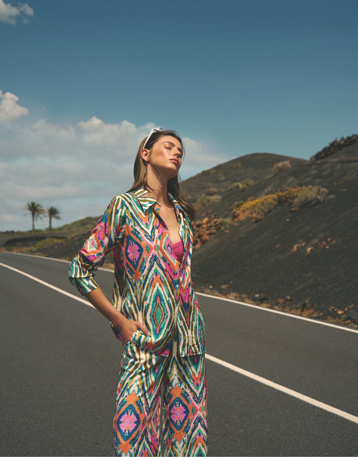
Pairing it with patterns for more originality
Gray is an excellent base for patterns because it visually calms the whole.
- Checks (Prince of Wales, subtle tartan): perfect for a jacket or pants.
- Houndstooth: graphic but classic.
- Thin stripes: very chic on pants or a blazer.
- Prints: a printed scarf can be enough to add a personal touch.
Mistakes to avoid when pairing gray
- All in the same shade and material: this can lack depth. Add texture, contrast, or a lighter/darker shade.
- Use multiple strong colors: gray allows boldness but benefits from remaining the guiding thread. One dominant color is often enough.
- Forget about tone consistency: a cool gray with a very warm beige can work, but requires balance (often through accessories or material). If you are starting out, stick to a harmonized palette (cool gray + white/pink/blue; warm gray + beige/camel/mustard).
Gray is therefore a versatile and resourceful color
It is one of the most useful and elegant colors in the wardrobe because it lends itself to all interpretations: minimalist with ivory, sophisticated with navy blue, warm with beige, bold with burgundy, bright with yellow. You just need to adjust the shade and find the right balance to reflect your personality.